Friday, 30 March 2007

Dreamweaver 2

Part 2 Of Dreamweaver


With a new document i clicked on the layout tab and then changed the mode from standard to layout if i do this i can use a new type of tables.


Then when i clicked on tables i get 2 new icons i clicked on the create table and it turns out alot different from the standard version. Clicking on the 2nd icon i can create tables in to other tables.



Dreamweaver


Dreamweaver

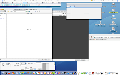
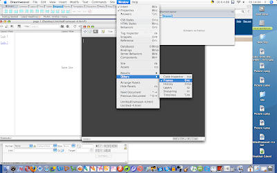
We learnt on how to create a web page with several links. We created a main page which we called Index then we also created a second page and then used the frames to put in the text to link the index to page 2 and vise versa.

To get to the frames option i clicked Window -- Others -- Frames


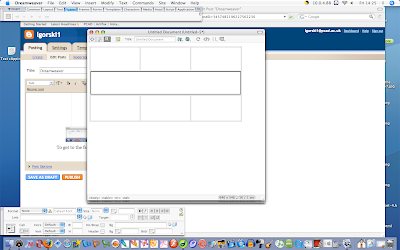
I clicked on the table tab then created a new table with the properties of 3 x 3. at the bottom of the document there is a button so i clicked that so i could edit the table. Then using the insert menu i pressed the merge button which will merge all 3 cells into 1.


Friday, 23 March 2007

Website Research

Website Research


Deviantart.com

One of my favourite sites is Deviantart. As a user of Photoshop and other photo editing software, this site is used to show off art as well as also helping people with tutorials or resources. I love the simple layout of this site as it is basic and easy to use so anyone can use it. Also the loading time is very quick for a site that has a lot of uploads on it. On this second screen print of devaintart, I have showed the available categories as they enable quick and straightforward access into browsing on this site. This makes the site tidier and easier for the viewers to find what there are looking for. At the top of the page, it clearly shows links to other parts of devaintart, such as the forum and the browse facility. Also I like the way the site is not bombarded with pop-ups and advertisements. Instead, these links are situated at the bottom of the page. Devaintart uses several neutral tones of greys, incorporated with a plain background so that it does not detract from the pictures on it's pages. They also use a simple font style in lower case. This is either in white, on the category list or in black, on the sub-headings.

Liskeard Town
The Liskeard Town website has been very poorly produced. The manipulated Photoshop graphics are very poor quality as the effect and type font do not match the image. The site uses a vile shade of yellow as it's background, which detracted my eye from it's actual content. They have used a fancy old-English font which is hard to read . I would strongly recommend that they change the font to make it a different style and enlarge it so that people can understand it more clearly. The layout on the page is quite basic. However, I believe that the buttons on the left hand side of the screen, are too overpowering and they bombard my vision. I would recommend that they should space out the buttons or cut down the amount of links to this site. This second screen print of the Liskeard site, shows this page which is intended to show the local landmarks in Liskeard, but they fail to do that. Instead, they just show three random pictures which are all in different sizes which creates an untidy feel about the layout. Unlike the Devianart site, this has no browse facility or search bar. This means that it will take the viewers longer to find what they are looking for. Also unlike Deviantart, this site is very slow to open despite their limited images.

Achieve360Points.com

This is an information site relating to the Xbox 360. Because of products highly graphical style, it is not surprising that the layout is nicely designed. They also cleverly incorporate the colour theme of the Xbox 360, which is quickly recognisable to the Xbox 360 users. The tone of green is very vibrant and modern without being too overpowering. The pictures used on this site, are all the same size and they are positioned in an precise and exact way. The font is very simplistic in style, but by using the same colour theme, it results in the site being tidy and enjoyable to view. This in turn keeps my interest. The whole site is well organised and professional produced. It is fun to use and easy to access links and sub-categories.


Pixel2Life.com

Pixel2life is a web page specifically designed for tutorials on most computer applications like Photoshop and much more. Pixel2life's layout is very similar to Devaintart, except Pixel2life have chosen a bright blue and bright green colour layout, which you possibly think would make this site look dreadful, but it doesn't. Instead, it adds a refreshing feel by using such clean colours. Pixel2life use a very basic layout for their site, such as having the links down the left hand side, and having all the information in the middle. The content can sometimes be hard to understand if the tutorials is not well described, but overall, it gives you all the information you would need spelt out in layman's terms. To summerise, this site really has no bad points. Whether you are a novice or an expert, this site will help you with all your computer applications.


MillionDollarPixelPage.com

The Million Dollar Pixel Page is a website full of advertisements. Any company can buy pixels for money, and as a result, an advertising banner from their company is displayed on the site. Overall, the concept of this site is amazing but the practicality isn't. It's main aim is to get people to click on the advertisements so that the company who have bought the pixels, will get their money back by sales. Because of the amount of small blocks of vibrant colours, this results in a overpowering appearance. The viewer may find it hard to concentrate on any one picture so it is a hard page to visualise. The apparent lack of layout contributes to it's untidy appearance. There are numerous text styles and sizes due to companies' individual choices and preferences. This then produces a complicated system that makes it slow to load which could affect viewer's tolerance.


Google.com

Google is one of the most simplistic websites around today. It's layout is basic and easy to use which makes it good for people who are not computer minded. On the homepage, the logo is the only picture. This consists of a default font made up from bright colours as it gives the site a feeling of fun. This then keeps the interest of the viewers.

Google's main point is the search bar which is located in the middle of the screen. By using this simple layout, it is easy to find and easy to navigate around the site. The search results come out in a perfect order with their corresponding websites underneath. The search is matched to your words in a descending order depending on the exact wording used, giving your results in ultra quick time. Everything on Google is well laid out and designed resulting in it's modern style. The content on this site is whatever you want it to search for. Goggle also includes an add-on which filters your results so you don't get any adult content. This is great for protecting children against the harmful elements available on the Internet.

Friday, 16 March 2007

Day3


Post3

I watched a documentry on the going on behind the google website. This did open my eyes to the things they keep hold of and do with everyone infomation but this is the best and easiest place to find what your looking for and fast which is why we still use it.

Day2


Post 2

I Watched the making of The Incredibles which was quite intresting to see how a full lenght animation was made so i know in the future what i should and should'nt do.

Day1


Post1

I created a blogger account using my email from college this will be used to show all the work i will be doing in this unit.